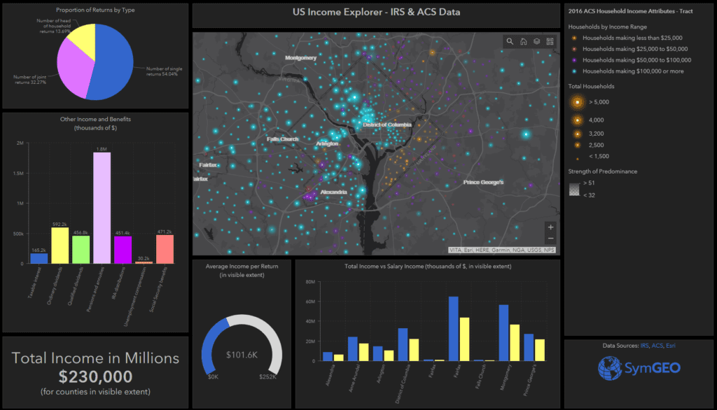
Ever wonder where the earners live? Looking for that link between education and income? Want to see how your community stacks up against the neighbors? Use SymGEO’s US Income Explorer to visualize and explore American Community Survey data from the US Census Bureau combined with income and benefit data published by the Internal Revenue Service, all delightfully symbolized using a novel “firefly” cartographic style recently published by Esri.
As explained very eloquently by Lisa Berry, a Cartographic Product Engineer at Esri, the symbology for the ACS data tells a very visual story by showing the predominant category for each data point, proportionally sized to the number of reporting households, and then given the brightness according to how dominant that category is compared to the other categories.
There’s a lot of data being calculated interactively to summarize only what’s shown in the visible extent. This allows a comparison between different areas within a state or around the country to be achieved relatively easily. Clicking on the map points or county areas shows a pop-up with detailed data, allowing a deep dive into the characteristics of select areas. A number of different ACS data layers can be turned on or off using the “layer” stack icon in the map viewing window.
The sharp geographic divides in neighborhood area characteristics can be quite shocking, and hopefully the presentation of this aggregated data by SymGEO will lead to productive discussions on how communities can work together to lessen those differences.
