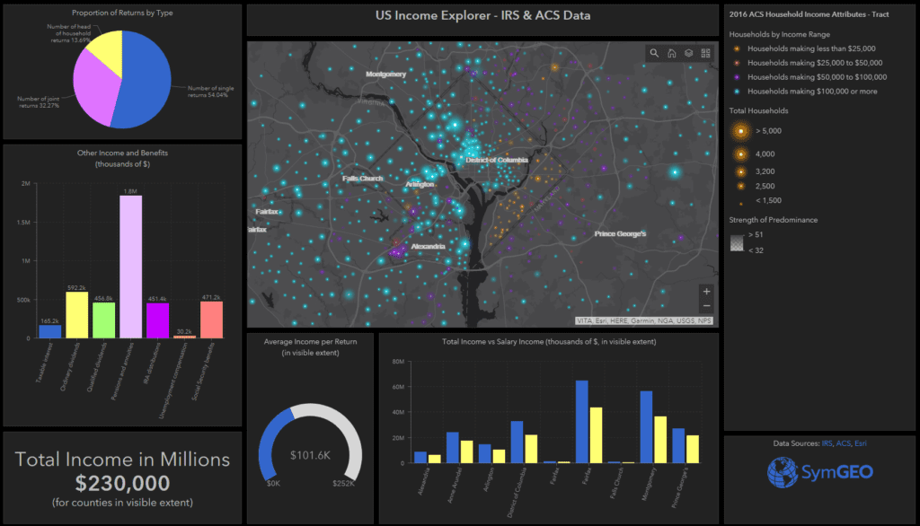
Ever wonder where the earners live? Looking for that link between education and income? Want to see how your community stacks up against the neighbors? Use SymGEO’s US Income Explorer to visualize and explore American Community Survey data from the US Census Bureau combined with income and benefit data published by the Internal Revenue Service, all delightfully symbolized using a novel “firefly” cartographic style recently published by Esri.
As explained very eloquently by Lisa Berry, a Cartographic Product Engineer at Esri, the symbology for the ACS data tells a very visual story by showing the predominant category for each data point, proportionally sized to the number of reporting households, and then given the brightness according to how dominant that category is compared to the other categories.
There’s a lot of data being calculated interactively to summarize only what’s shown in the visible extent. This allows a comparison between different areas within a state or around the country to be achieved relatively easily. Clicking on the map points or county areas shows a pop-up with detailed data, allowing a deep dive into the characteristics of select areas. A number of different ACS data layers can be turned on or off using the “layer” stack icon in the map viewing window.
The sharp geographic divides in neighborhood area characteristics can be quite shocking, and hopefully the presentation of this aggregated data by SymGEO will lead to productive discussions on how communities can work together to lessen those differences.
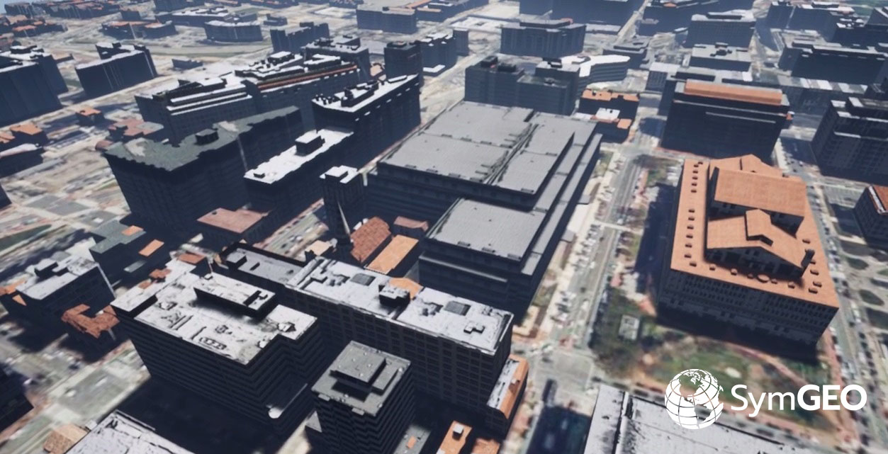
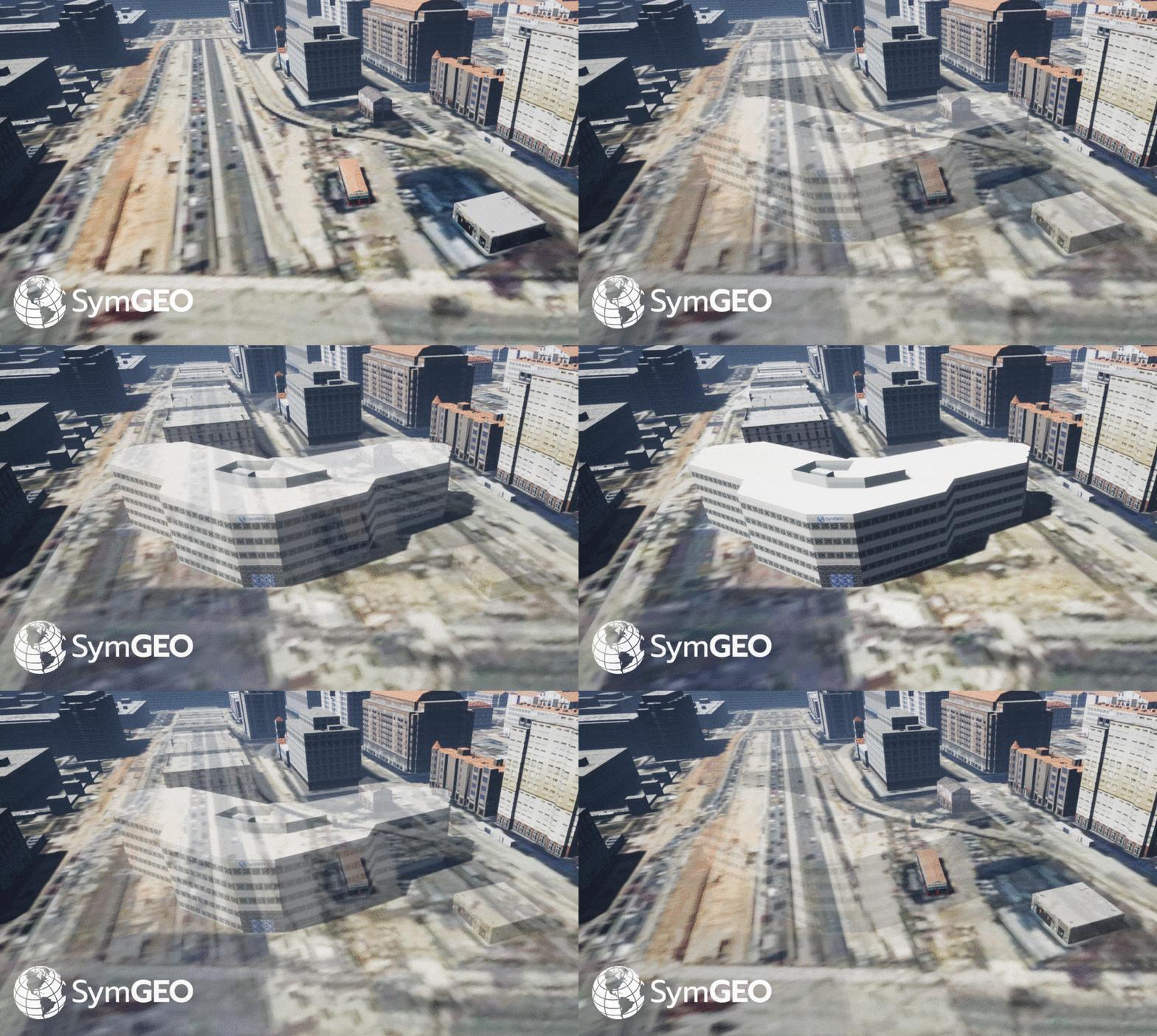
SymGEO is excited to share a peek behind the scenes into our cutting edge 3D building visualization products leveraging Esri CityEngine and a little post-processing magic. The end result is a virtual environment that can’t wait to be explored! Each building is generated from building mass information or building footprints. Textures are added based on zoning information and can be fully customized if building photography is available.

Once the existing environment is built out, the fun begins of playing “what-if” scenarios for proposed commercial or residential developments.

Full control over camera and environmental variables allows the presentation of 3D building data in the optimum light.

Video fly-over gives the ultimate in bird’s eye perspective and allows stakeholders full visibility into a proposed development.
Needless to say, this powerful combination of software makes compelling, cost-effective 3D building presentations a reality.
Check out our fun, promotional video on YouTube and let us know if your world is ready for this!
SymGEO is pleased to share a free and interactive Global Water Risk Dashboard to help inform policy decisions on water risk and spark international discussion around the world. Powered by Esri’s ArcGIS dashboard technology, this configurable application is based on population data provided by CIESIN, overall water risk data from Water Resources Institute, and country boundary data from GADM.
From WRI: “Overall water risk identifies areas with higher exposure to water-related risks and is an aggregated measure of all selected indicators from the Physical Quantity, Quality and Regulatory & Reputational Risk categories. Physical risks related to quantity identify areas of concern regarding water quantity (e.g. droughts or floods) that may impact short or long term water availability. Physical risks related to quality identify areas of concern regarding water quality that may impact short or long term water availability. Regulatory and reputational risks identify areas of concern regarding uncertainty in regulatory change, as well as conflicts with the public regarding water issues.”
These data sets can be explored in detail in the WRI’s Aqueduct application.
The data was processed in ArcGIS Pro to aggregate the number of people in each country by overall risk category using zonal statistics. Once processed and symbolized, the data was then published and hosted in ArcGIS online, from which the Operation Dashboard was constructed. Charts and numerical summaries update interactively based on the map window extents, and clicking on a country of interest reveals detailed overall water risk data for that country.
Check out the Global Water Risk Dashboard today and let us know what you think!
- « Previous
- 1
- …
- 6
- 7
- 8

