National Forest Foundation: Wildfire Modeling

The National Forest Foundation (NFF) was chartered by Congress and created with a simple mission: bring people together to restore and enhance our National Forests and Grasslands. Part of this nonprofit mission includes planning for wildfires and mitigating their impact by understanding fire behavior across a landscape. SymGEO was honored to partner with the NFF to explore wildfire modeling approaches and analytical results by combining GIS data processing with the Interagency Fuel Treatment Decision Support System (IFTDSS). The results of this project will help inform internal planning efforts and future studies.

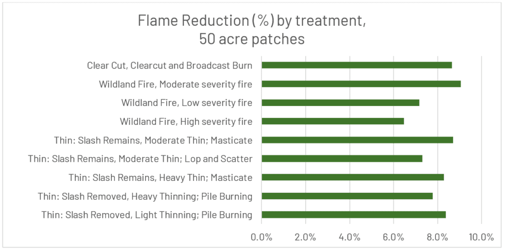
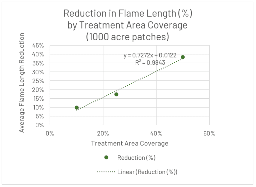
The project area was located in Flathead National Forest, Montana, and was approximately 250,000 acres in size. Extensive modeling was performed using IFTDSS to determine how effective different landscape treatments were at varying treatment patch area sizes and total coverage amounts. Conceptually, treating fewer large patches would be more effective than treating a greater number of small patches distributed across the landscape (based on wildfire behavior). However, determining the level of effectiveness required landscape modeling and statistical analysis. Similarly, other relationships were explored, such as what is the relationship between the total treatment area and treatment effectiveness? Does a 10% coverage result in a 10% decrease in modeled wildfire results? What happens at 50% coverage? Only one way to find out!

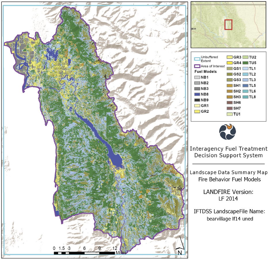
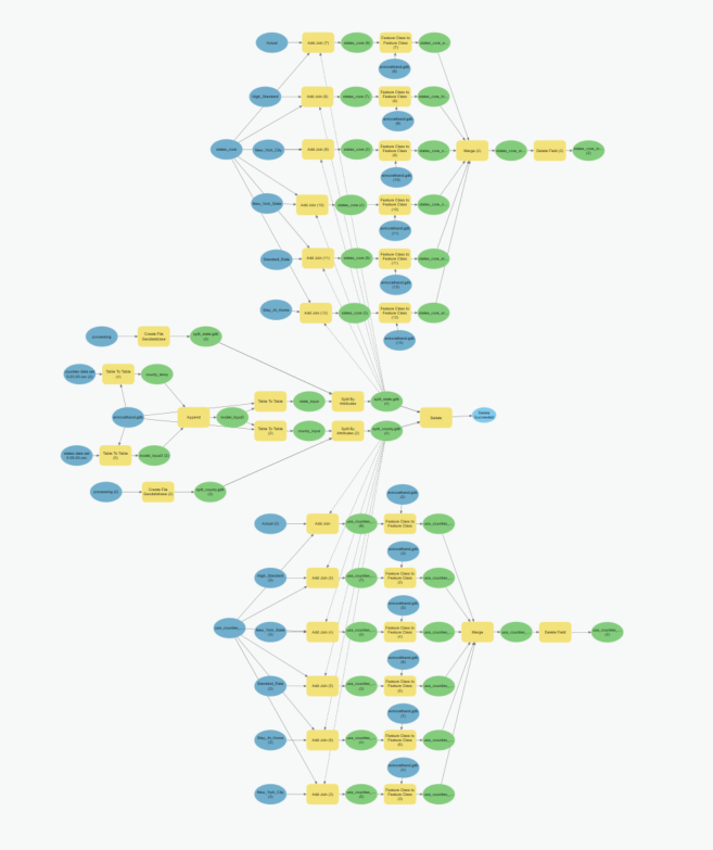
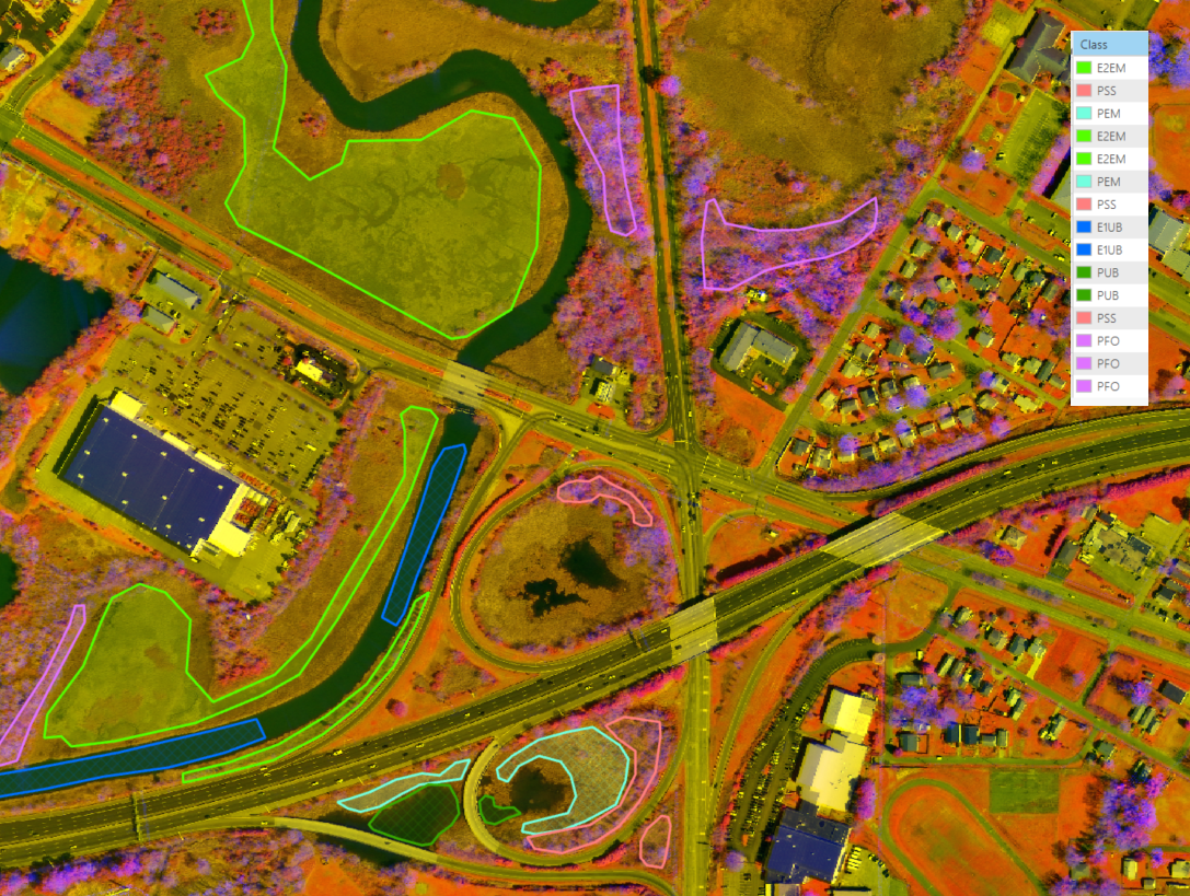
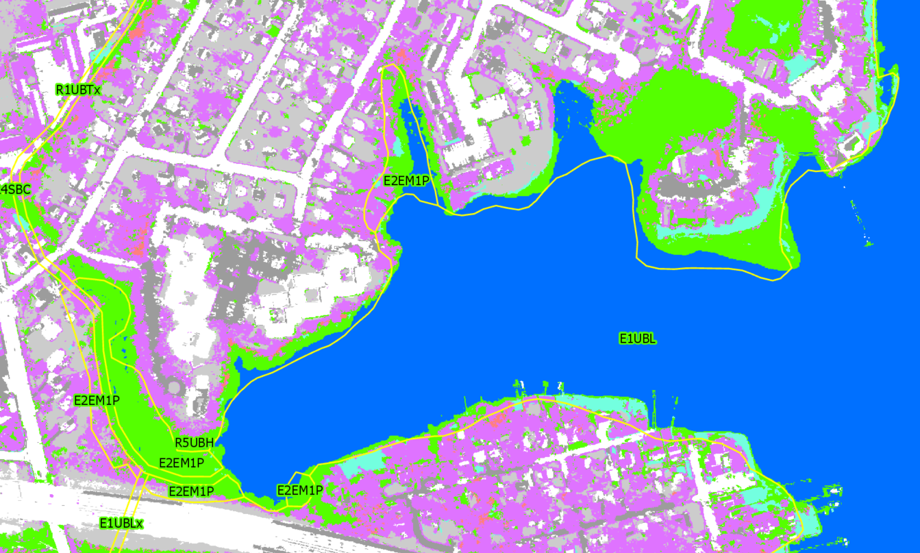
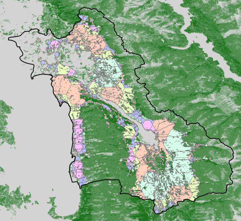
GIS processing using ArcGIS Pro was used to screen out areas that couldn’t be treated based on slope, canopy cover, distance to streams, fire return interval, and several other factors. Tessellated grids were then developed at scales ranging from 100-acre patches up to 5,000-acre patches and fit into the treatable areas.

Average flame length was measured for untreated base conditions and then used to measure the effectiveness of treatment options.

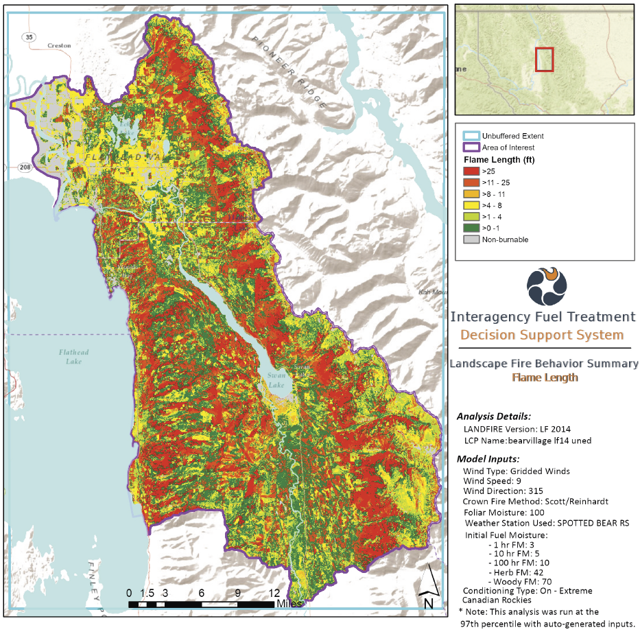
Initial results indicate that measurable differences were observed across treatment types, treatment patch sizes, and treatment total coverage areas.

“SymGEO provided expert guidance around the analytical approach to explore fire resiliency GIS modeling. The IFTDSS modeling they provided was appreciated along with the framework to help the National Forest Foundation continue this important endeavor. They are excellent to work with and highly engaged in the process.

– GIS Program Developer, National Forest Foundation

Talk to SymGEO today if your organization wants to explore data modeling processes and analytical results using ArcGIS Pro together – we are certified experts and here to help.

Flood Impact Visualization

SymGEO is excited to demonstrate flood visualization technology built on the Esri Local Government 3D Basemap Solution.  In this example, the City of Laurel, Maryland, has a number of buildings that are located in the floodplain and are therefore at risk of flooding. This information can be conveyed using the FEMA National Flood Hazard Layer (NFHL) Viewer as shown below, but we decided to bring this data to life using an Esri ArcGIS Solution instead!

Our journey began with a virtual trip to the Maryland iMap GIS data portal to download the best-available LiDAR data for our area of interest. We then visited the Maryland-National Capital Park and Planning Commission GIS Open Data portal to get building footprint information. Finally, after following the defined steps in the ArcGIS Local Government Solution, we were able to visualize flood impacts in realistic 3D from citywide to local perspectives.

Realistic building textures, vegetation, and current imagery allow the user audience to recognize features and landmarks during demonstrations. Streets can be labeled, and buildings of interest can be highlighted with either labels or colors to call attention to focus areas.

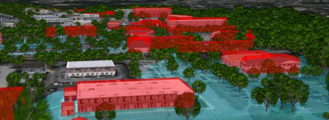
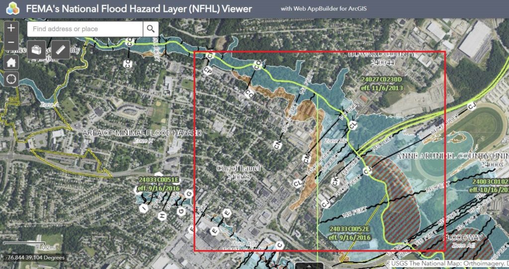
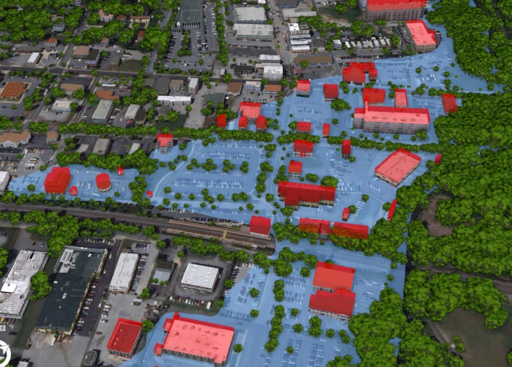
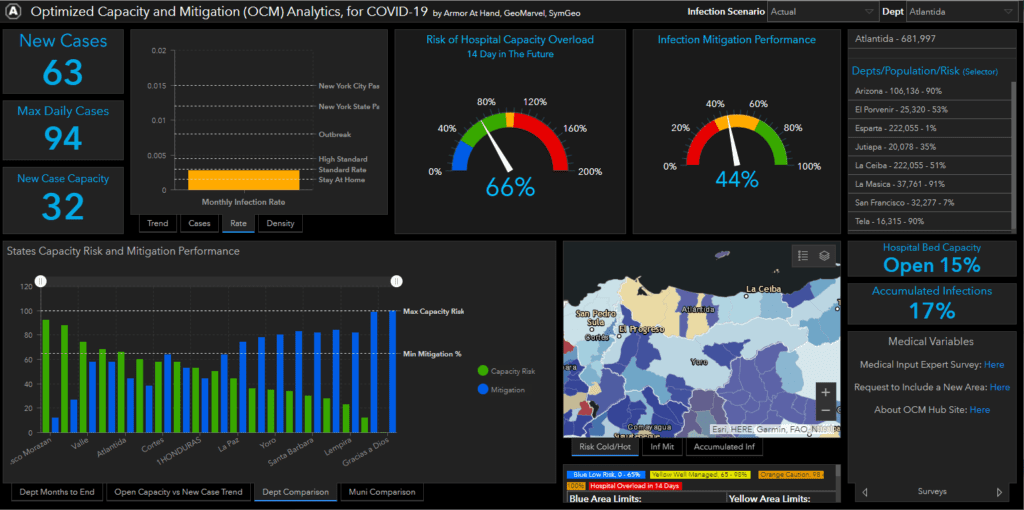
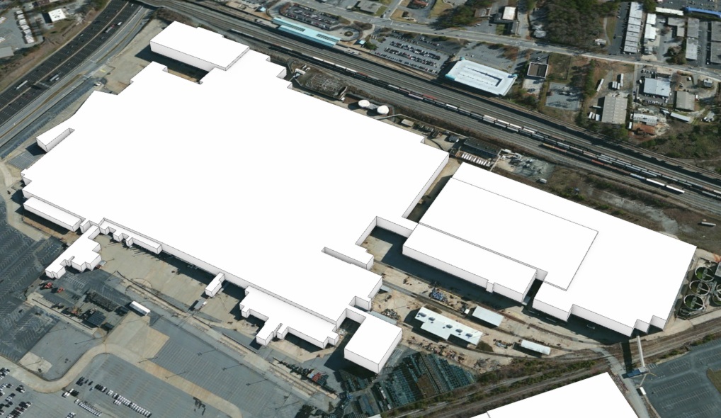
Continual improvements using Esri’s 3D rendering and animation technology enable fly-throughs, call-outs, layer transitions, time-lapse visualizations, and other features and functionality that make this 3D basemap solution the perfect tool to communicate risk and mitigation plans.
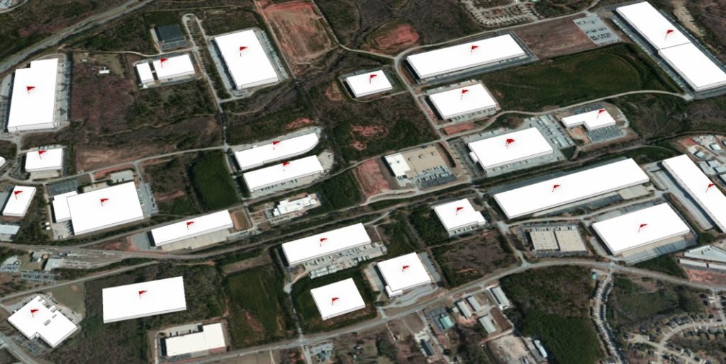
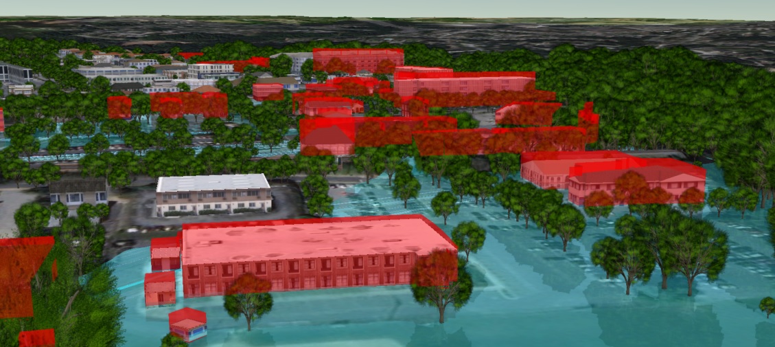
Contact SymGEO for your 3D visualization and communication needs and start a conversation today!

COVID-19 Honduras

When our collaborative partners at Armor at Hand asked us if we were willing to continue our pro-bono work to fight the devastating effects of COVID-19 and help the people of Honduras, we didn’t hesitate. The result of this international work can now be seen in the Optimized Capacity and Mitigation (OCM) Honduras Dashboard.

This dashboard leverages data specific to Honduras and is a variant of the US version. This required significant updates to the modeling process and data files as well as a reconfiguration of the dashboard to reference the new data schemas. ArcGIS Online Assistant was used to facilitate the substitution of ArcGIS web maps and data services, and a new python script was developed to keep the Honduras data current.

For more information about the data model developed by Armor at Hand that powers the dashboard, check out the OCM Hub page, OCM whitepaper, or OCM ArcGIS Marketplace listing.

Talk to our industry experts today to help you leverage your spatial data with an ArcGIS Dashboard, ArcGIS Hub site, or the ModelBuilder process – SymGEO is here to help!

3D building production

SymGEO was honored to work with a leading commercial real estate broker to identify and construct almost 1500 industrial buildings in 3D. Using a provided list of addresses, the buildings were geocoded using ArcGIS Pro and visually inspected to validate the location. We then used Esri’s “World Image Clarity” basemap and ArcGIS Pro editing tools to construct building footprints and to segment them based on roof shadow lines. Roof heights were assigned based on known values or were given a default value if unknown. Buildings ranged from “quite simple” to “reasonably complex”, but we worked tirelessly to complete the task!

“Thanks again for all your work on this.”
– Program Manager, Client Confidential

Contact SymGEO for your 3D digital needs and start a conversation today!

Targeted marketing with ArcGIS

Have you ever wondered where the best places to market your services are? Sifting through a list of thousands of potential contacts can be rather daunting, but fortunately, ArcGIS geocoding can bring that task down to a manageable size.

SymGEO recently worked with a confidential medical group to identify provider locations and potential targets that included rural health clinics, medically underserved areas (MUA), medically underserved populations (MUP), primary care facilities, dental care facilities, and mental health facilities. This information was then cross-correlated with ten thousand certified and licensed providers to determine the optimal areas for marketing campaigns.

“That’s perfect! This has been a lifesaver.”

– Client Confidential, medical services marketing

Due to the sensitive nature of this information, we can only share generalized graphics, but the power of GIS and locational analysis saved time, energy, and money during the sales and marketing process.

Contact SymGEO today with your sales and marketing needs!


COVID-19 Mitigation Analytics

Returning to “normal” after (or during) a global pandemic is a complicated prospect. Finding the right balance between the potential rate of infection based on social distancing scenarios versus hospital capacity to handle projected cases requires advanced spatial modeling and analytics. Needless to say, when SymGEO was asked to help our national recovery effort by our respected peers in the industry, GeoMarvel and Armor at Hand, we were happy to do as much as possible to assist.

The result of this collaboration is the Optimized Capacity and Mitigation (OCM) Analytics Dashboard, free for use in the ArcGIS Marketplace to assist with COVID-19 mitigation efforts. This dashboard is designed to use current hospital capacity data, infection rate scenarios based on demonstrated or projected epidemiology statistics, and peer-reviewed variable modeling methods. The history of this project is described on the OCM ArcGIS Hub site and summarized in an informative OCM whitepaper.

As modeling scenarios become more sophisticated and our understanding of infection rates is improved, this information can be used to augment the dashboard results. This information can be submitted by subject matter experts through an integrated survey on the ArcGIS Hub site.

ArcGIS Pro ModelBuilder was used to facilitate and standardize the modeling updates and data tables used by the dashboard. The model was then converted into a Python script, designed to be run as needed to keep the data current and informative.

Check out the OCM Dashboard, OCM Hub page, or OCM ArcGIS Marketplace listing to learn all about this project and let us know if SymGEO can help you leverage your spatial data with an ArcGIS Dashboard, ArcGIS Hub site, or the ModelBuilder process.

Croatia Rail Dashboard in ArcNews

We are excited and honored to announce that our World Bank asset management work in Croatia has been published in ArcNews Spring 2020 edition! We had lots of fun crunching data, solving international geospatial mysteries, and leveraging ArcGIS Dashboard and ArcGIS Pro capabilities. It’s not every day that our work is featured in front of an audience of 900,000 GIS professionals, so come see what all the excitement is about!

Check out the article to learn all about this project and let us know if SymGEO can help you leverage your spatial data with an ArcGIS Dashboard.

Croatia Rail Esri Case Study

SymGEO is honored to have our World Bank asset management work in Croatia featured as a successful case study by Esri! We had lots of fun crunching data, solving geospatial mysteries, and leveraging ArcGIS Dashboard and ArcGIS Pro capabilities.

operations dashboard case study

This solution was also featured on the ArcGIS Dashboard product page as a good example of what can be done with this flexible and powerful technology.

Check out the case study and let us know what you think!

Remote Sensing of Wetlands

SymGEO is proud to announce a new project with the Virginia Department of Transportation (VDOT), designed to explore the use of remote sensing techniques in the identification of wetlands. Traditional wetland delineation requires expert field work, which includes many hours of travel, sampling, and precise survey measurement to delineate what can actually be quite a variable environmental boundary. The best indicators of wetlands tend to be the vegetative species, ground elevation, and hydrology connectivity. Soil sampling and other methods are used to further validate findings, but in today’s data-rich environment, a pretty good indication of wetlands can be gathered through remote sensing.

For this project, LiDAR elevation information was combined with multi-spectral imagery to produce a 6-band composite image using ArcGIS Pro. This composite image was then used in conjunction with National Wetland Inventory (NWI) data to establish training sites for a supervised classification algorithm.

Once a suitable number of training sites were established, the supervised classification algorithm was run on the pilot study area. The results were compared with the National Wetland Inventory data, and a substantial improvement in boundary alignment was noted. This is critical in the accurate measurement of potential impacts to wetlands during road construction or property development, so that an equivalent, mitigating wetland area can be created elsewhere.

It was noted that upland forested areas were sometimes identified as wetland forested areas, indicating that elevation relative to nearest water needs to be included in the classification algorithm. The classification results are currently used as a guide for semi-automated wetland area delineation, but we believe the model could mature to include all required factors and accurately, automatically delineate the wetlands.

If you have supporting data and a need for efficient wetland delineation, SymGEO would love to talk!

Workflow Automation

I admit, I resisted for years. Workflow automation seemed like too much work to set up, and I always argued that my spatial data challenges were mostly one-off unique situations that weren’t conducive to setting up a workflow. Until one recent day I saw the light… and I blame California.

Perhaps you remember our work to incorporate near real-time remote sensing into crop drought monitoring? Well, it turns out that to keep an application like that up to date, the same process is needed time and again, and so the need for data automation was born into the world of SymGEO. Through automation, data layers and attribute fields are always named the same, and features can be over-written without fear of “something breaking” deep within a configurable application. There is also the added benefit of incorporating the usual workarounds that go into regular behind-the-scenes geospatial work such as calculating areas as acreage, or converting grid values into meaningful text. This saves countless hours of frustration and memory searching down the road when trying to repeat a process.

Needless to say, this does cause a model to expand once all the pieces are bolted on, but Esri’s ModelBuilder allows the easy configuration (and re-configuration) of the model until all works as designed.

workflow automation

This model has been run many times to make sure all products worked as expected, especially during initial configuration. However, the time savings was considerable with workflow automation given the number of steps involved and the dependency on intermediate layers. In hindsight, it seems to be the finding and configuring of the tools that takes time, not the actual running of the tool.

model processing

These work products were used to produce and optimize the Crop Drought Status dashboard, which is now ultra-responsive and designed for use at the county-level.

crop drought status dashboard

If you’d like a second pair of eyes on your data workflow, let us know, as SymGEO is ready to automate with ModelBuilder!