Crop Drought Status in California

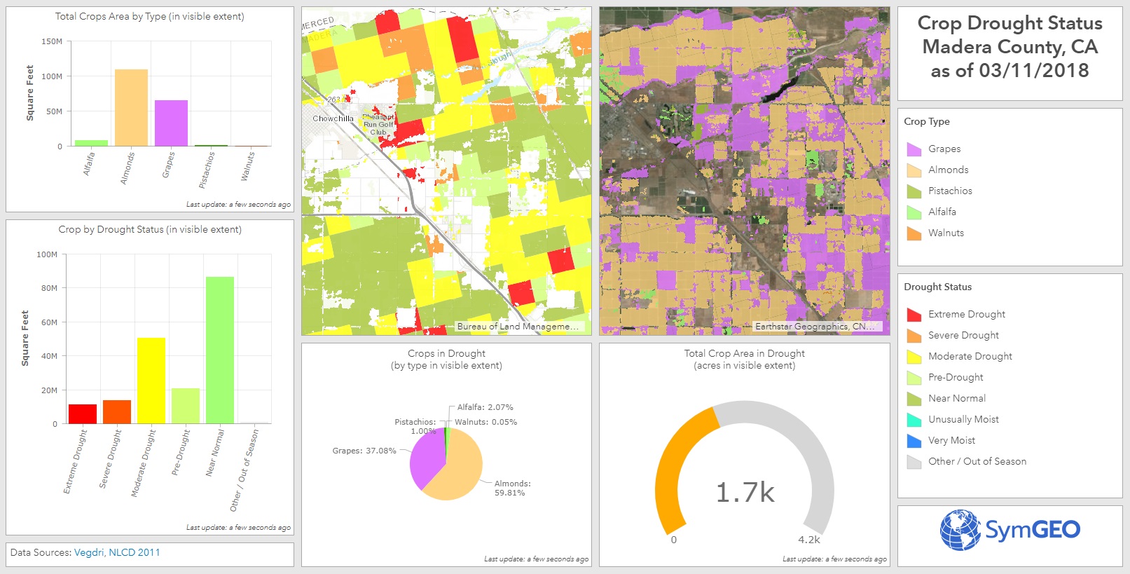
SymGEO is pleased to share a glimpse into what’s possible using near-real time satellite sensor data and the power of GIS to produce a Crop Drought Status dashboard. In this example, we have used vegetation drought status and intersected it with crop data for a county in California to determine which crop types and how many acres are at risk. The vegetation drought data is available on a weekly basis nation-wide at relatively fine granularity with approximately a one week production lag-time, so it provides a very current glimpse into the on-the-ground situation.

Crop Drought Status in California dashboard

This information could be used by farmers or irrigation districts for the planned allocation and distribution of water resources, leading to better decision for our agricultural industry. It could also provide insight into crop prices or forecast yields based on existing or modeled conditions.

The data was processed in ArcGIS Pro to convert the satellite data into usable classifications and then intersect the drought conditions with the crop type data. Be sure to learn more about how the processing was automated using Model Builder! Once processed and symbolized, the data was then published and hosted in ArcGIS online, from which the dashboard was constructed. Charts and numerical summaries update interactively based on the map window extents, and the two map views are synchronized to allow side-by-side comparison.

Check out the Crop Drought Status dashboard today and let us know what you think!
Global Water Risk Dashboard

SymGEO is pleased to share a free and interactive Global Water Risk Dashboard to help inform policy decisions on water risk and spark international discussion around the world. Powered by Esri’s ArcGIS dashboard technology, this configurable application is based on population data provided by CIESIN, overall water risk data from Water Resources Institute, and country boundary data from GADM.

From WRI: “Overall water risk identifies areas with higher exposure to water-related risks and is an aggregated measure of all selected indicators from the Physical Quantity, Quality and Regulatory & Reputational Risk categories. Physical risks related to quantity identify areas of concern regarding water quantity (e.g. droughts or floods) that may impact short or long term water availability. Physical risks related to quality identify areas of concern regarding water quality that may impact short or long term water availability. Regulatory and reputational risks identify areas of concern regarding uncertainty in regulatory change, as well as conflicts with the public regarding water issues.”

These data sets can be explored in detail in the WRI’s Aqueduct application.

The data was processed in ArcGIS Pro to aggregate the number of people in each country by overall risk category using zonal statistics. Once processed and symbolized, the data was then published and hosted in ArcGIS online, from which the Operation Dashboard was constructed. Charts and numerical summaries update interactively based on the map window extents, and clicking on a country of interest reveals detailed overall water risk data for that country.

Check out the Global Water Risk Dashboard today and let us know what you think!